In brief
Useful furniture CGI references show overall dimensions alongside close views of grain, weave, stitching and surface finish. Include approved material variants and explain the lighting and setting, so a studio image and a lifestyle scene present the same product consistently.
Define the character of the product
A furniture visualisation needs to explain more than a silhouette. It can communicate the softness of upholstery, the direction of a timber grain and the way a chair sits within a room. Begin by deciding which qualities matter most and which details distinguish this particular product from a similar one.
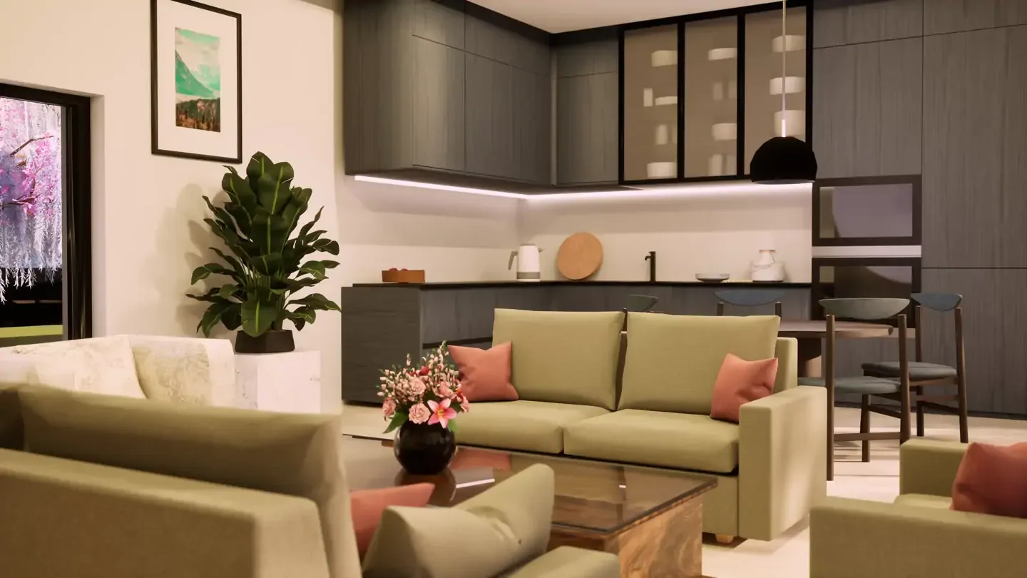
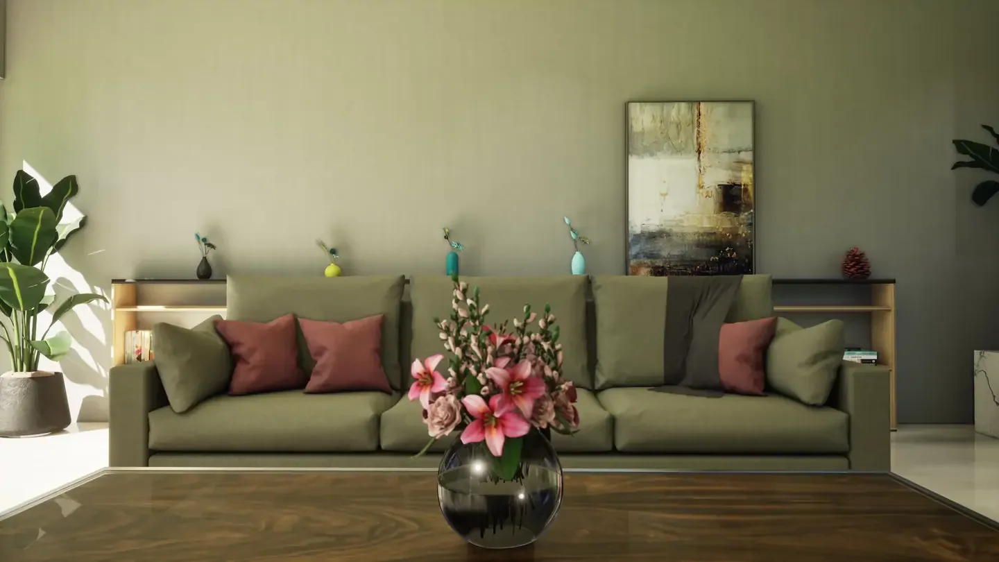
Choose the role of the setting early. A clean studio image makes shapes and finish options easy to compare. A lifestyle scene introduces scale, atmosphere and a sense of use. Both can be valuable, provided the surroundings support the product and do not compete for attention.
Make material references specific
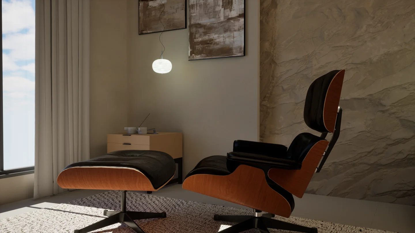
Send close photographs as well as wider views. For timber, show grain direction, edge treatment and the relationship between adjacent surfaces. For upholstery, include seams, piping and the size of the weave. For metal or lacquer, show how the surface responds to both direct and softer light.
A colour name alone leaves plenty of room for interpretation. Add supplier references and photographs taken in neutral lighting where available. Explain whether a finish is matte, satin or gloss, and identify any variations that are intentional. If samples differ, nominate the reference that should guide the visualisation.
- Overall dimensions and clear photographs from several angles.
- Close references for grain, weave, stitching and surface texture.
- Approved finish variants and the names used in your catalogue.
- Details that must stay consistent across the whole image set.
Let the light explain the form
Lighting changes how a material reads. A broad light source can reveal gentle curves, while a controlled highlight can describe an edge or a polished surface. References should therefore show the intended atmosphere as well as the product itself. Identify whether the goal is a neutral catalogue view or a more expressive campaign image.
Review several finishes under a consistent setup before approving the full series. This makes comparison easier and helps reveal whether a dark fabric loses its texture or a reflective surface distracts from the shape. Check the product at both full size and the smaller scale used on a listing page.
Plan a useful image family
List the required views before styling the scene: a main image, side or rear view, material detail and contextual composition. Agree background treatments, crops and naming conventions. A coherent image family helps a customer move from an overall impression to the details that matter, while giving your team assets that work across a catalogue, website and launch campaign.
Have an idea of your own? Talk to the studio